
Case Study
263
Leads
$144,000
Closed
Thrive
You can learn a lot about KME Systems from their tagline: “We give a damn.” Genuine and straightforward. Their theme is built around the idea of helping their clients “THRIVE.”

“They’re people who are in your face in a good way. They just care about doing a good job.”
Copy
KME Systems doesn’t mince words. They’re candid and direct, and so is their copy. No fluff and no passive language. It’s all about action.

“The tone is quick and focused. There’s a lot of fast-paced energy. It gets right to what matters. That’s why we used plenty of bullet points.”
Design
The site has a orderly structure that’s easy to navigate. The colors are distinct. The lines are crisp, straight and symmetrical. The icons, images and text are both dynamic and tidy.

“The idea with the logo was KME takes disorganized things and organizes them. The clutter of red squares going into the logo come out of the ‘e’ in a neat line.”
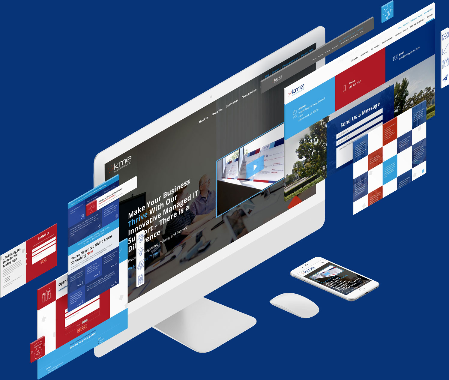

“Getting shapes into specific positions was new to us. We used grid boxes to achieve this look and to scale to screen size,”
Tetris Layout
The boxes in KME’s logo find their way into every aspect of the visual design. Because of the way they’re shown falling into place, they have a Tetris-like feel. The message is clear. KME brings order out of chaos.
Presentation
KME also has a custom PowerPoint presentation featuring the “super suit” analogy. Some superheros have gear to enhance strengths and overcome weaknesses. KME does the same for their clients.
“We created this PowerPoint presentation for them that focuses on challenges, hurdles and showing potential clients how KME will help them perform better.”
Development
The site was deceptively complex to engineer. The systematic look of it required some clever coding on the back end.
“Their entire site is built around these cubes. It was interesting coming up with a good way to code them. It was just a fun site to build.”
Video
The video features the owner, Mark, talking about KME’s commitment to their clients, as well as shots of the rest of the KME team in action. It’s personable, engaging and informative – all in under two minutes.
“Mark is like a Renaissance man. He started his career as a literal rocket scientist. He has his pilot’s license. He has a lot of interests. It’s hard to make IT cool, but Mark does.”
