
I was recently tasked to find out what constitutes exceptional email design. As a marketing writer, my normal idea of a “good” email is plenty of relevant text with a relatable pun sprinkled here and there for good measure, and maybe a cool picture or two.
But I’d come to learn that in the digital marketing space, it’s much more than that.
I had two options. I could write down some educated guesswork about keywords, font selection, white space and kerning (which I came awfully close to). Or, I could put on my investigative hat and go down the rabbit hole to find out the truth.
In an uncharacteristic fashion, I chose the latter. Sans hat.
The Search Begins
Many months ago, a fellow goofball writer had a bright idea. They thought it’d be a hoot and a half to sign me up for the Red Lobster newsletter and email list. At the time of writing this blog post, I can confirm that those damn emails are STILL coming in. Every other Monday, I open my email to see a fresh new announcement about how Endless Shrimp® are back, or how the honest fisherman at the Cheddar Bay enjoyed a fresh and bountiful biscuit season.
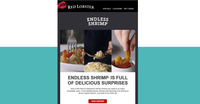
As much as I’d like to prattle on about my love for the Lobster (or the ‘Ster, if I’m in a rush), the truth as to why I don’t unsubscribe is actually stupidly simple. They don’t just effectively inform me of freshly-caught seafood at fair market value. They actually provide an interesting and captivating aesthetic that compels me to click to see more.
In other words, I open and click through those emails because they look good. I come for the design, and I stay for the content.
I felt like I had uncovered something big, like when Professor Robert Langdon from The DaVinci Code finds out stuff about Jesus. Questions rushed through my mind at a mile a minute.
Did we follow a certain set of email layout best practices? How did we, as a company, decide the aesthetic feeling of individual clients, and how did that translate to email design? How do we marry the copy and the graphics to deliver the right message? Could we pick up some shrimp marketing?
Despite my passionate arguments, TRIdigital won’t endorse shrimp campaigns. But it turns out the other two questions warranted deeper research, so I set out on my way to find someone that could answer them:
A professional designer. And a talented one at that
The Meaning Of Exceptional Email Design
I thought long and hard about whom I could interview. My choices were equal between Richard Pettis (company co-founder and master designer) or Ricky Albertorio (not co-founder but still master designer). My gut told me to go with whomever looked less busy.
They both looked busy.
I no longer listen to my foolish gut, so I just winged it and chose Ricky. Well, alright. It’s mostly because I dig his varying hat selection.
Luckily for me, he was more than happy to fill me in on the secrets of email design. It’s boring to just tell you what happened, so I’m going to narrate it as best as I can. Here we go.
I barged into his office gracefully and somewhat handsomely.
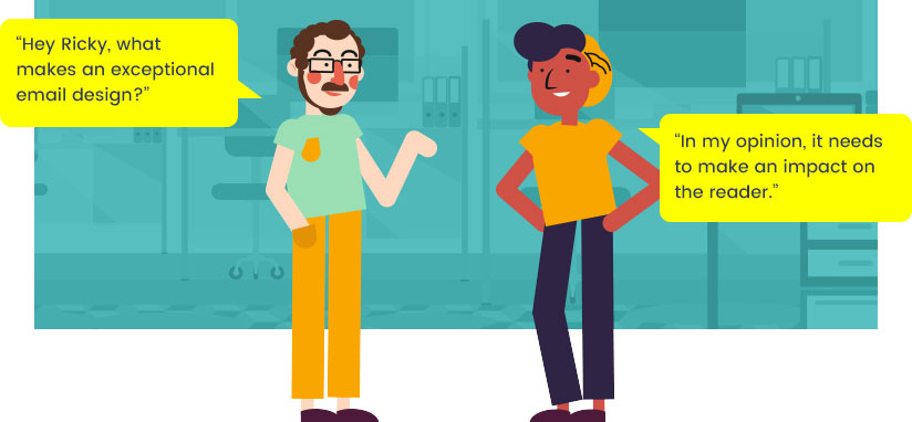
“Hey Ricky, what makes an exceptional email design?”
Ricky paused his work and looked up from his computer. He thought for a moment, in that thoughtful way he has about him.
“In my opinion, it needs to make an impact on the reader. Both in content and design. It literally comes down to a matter of seconds before your reader bounces, so there’s a huge challenge. How can you communicate and captivate the reader within this timeframe, while being as accurate and descriptive as possible?”
I was dumbfounded. So many have chalked up marketing design to interesting pictures and snappy copy, but it was becoming clear that it was so much more than that. In a really cool and collected way, I said:
“So are there like, weird colors to avoid, or…?”
Ricky patiently smiled. He knew he was dealing with a smart but non-designerish dude, so he responded in a similarly cool fashion.
“TRIdigital’s mission has always been to innovate and change the way the IT industry does marketing. We do that by highlighting what makes our clients unique. Their culture, their people, and even their philosophy. When people think of IT, they generally think of analytical, stern, and almost robotic individuals. Their emails generally reflect that.”
Ricky paused for a moment, collected his thoughts, and continued his thoughtful explanation.
“So, imagine the surprise of our clients and their prospects when they receive an email about IT Solutions that has a personality of its own. The content has its own voice and its own tone. The design is different, unique, personable. You know that you’re dealing with people, not robots. Those things combined make an exceptional email, and that’s exactly how we design them at TRIdigital.”
I was upset that he didn’t answer my color question, but I continued to listen closely.
The Logic Behind Our Emails
Ricky leaned back in his chair and stroked his majestic moustache. He continued with his explanation calmly.
“If you get one of our emails, you’ll notice that they’re longer than the industry standard. That’s to show how our clients are knowledgeable in their industry. Through lots of research, we found that people get more engaged in services and solutions if the email is longer. Shorter emails, on the other hand, work better for products.”
I was finally getting the good stuff. I scrambled to shield myself from the radiation of the knowledge bomb Ricky was dropping on me.
“We have a couple of different email layouts, which we use depending on the subject matter and overall message we want to convey. There’s a ‘Z’ pattern email, which follows the natural movement of eyes. We also use a single column email that works well for concise subjects and follows a no-nonsense approach. We jump between them for versatility and to keep things fresh with the content of our clients.”
There was one more thing I needed to know. What’s the deal with the lack of stock images? I nodded slowly and asked:
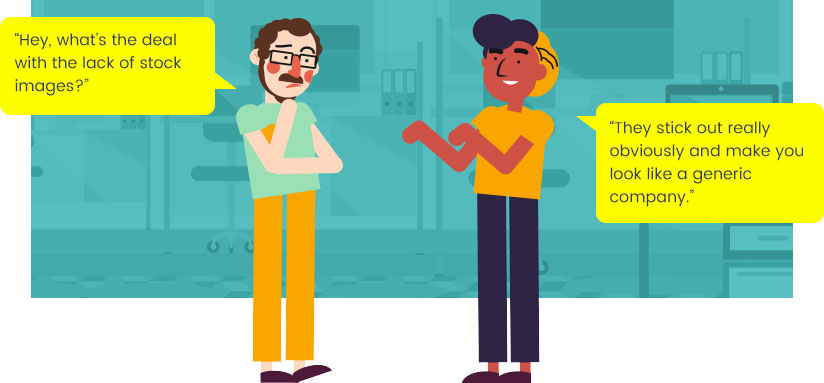
“Hey, what’s the deal with the lack of stock images?”
Ricky quickly replied:
“They stick out really obviously and make you look like a generic company. They can be useful, but relying on them too much makes you come off as typical and uninteresting. People want to see who they’re partnering with. They want to know who’s on the other side of the phone. Using real photography lets them get a better understanding of who they’re working with, and it looks much better overall.”
With that, I felt that I had enough information to understand the role design plays in email effectiveness.
I barged out of his office quickly and respectfully.
The Content Communication Breakdown
As good as Ricky’s answers were, I knew that they were only part of the whole story. I don’t mean to toot my own horn, but I’m actually a master copywriter myself (toot toot).
I realized that while email design is a vital part of email effectiveness, it is essential to complement it with superb copy. At TRIdigital, we use a varying amount of wireframes and templates to create that copy for effective emails.
Currently, we’ve got five templates that we use. A “Z” pattern email, a long column, a short column, a video email, and a notification email. Each of these wireframes were created with specific purposes in mind, but it’s ultimately up to the copywriter (that’s me) to decide which one is the best fit.
Naturally, we don’t limit ourselves to just these five. If there’s an interesting new format we’d like to try, we discuss it internally and consider its practicality and potentially effectiveness.
In short: If it’s doable, we’ll tackle it. If it’s not, we’ll find another way – but that’s a story for another time.
Here’s the breakdown of how each email wireframe works, and when they’d be used:
The Z Pattern
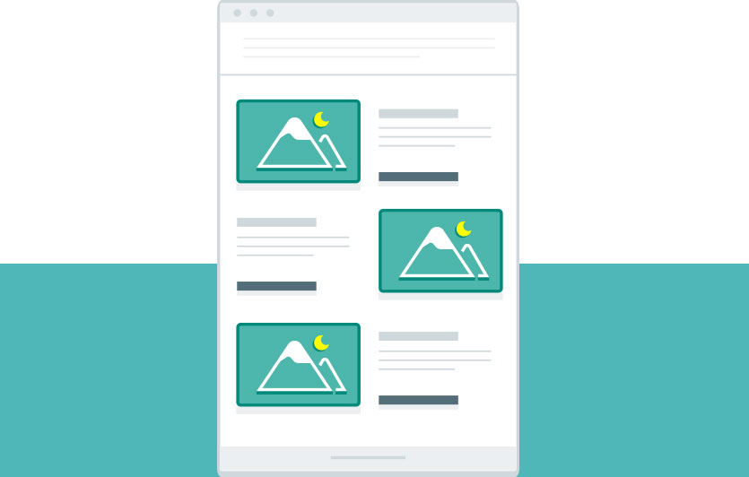
Pros: Multiple sections give you multiple ways to hook the readers. There are plenty of chances for varied content, allowing you to spread links to wherever you see fit. Z (aka zig-zag) pattern emails follow the natural movement of the human eye, facilitating content flow.
Cons: Requires an attentive reader that will read all content blurbs. Providing multiple graphics and call to action (CTA) button links can overload some readers, so keep copy brief and straightforward.
Best for emphasizing multiple points or benefits.
TRIdigital copywriting experts use Z emails frequently to push multiple content pieces. For example, to lead readers to a landing page, we’ll have three sections listing enticing information on each section.
The trick is to include just enough to make the reader naturally want to go to the page. We often use the same link for all CTA buttons, which ensures that readers are always directed wherever we want them to go.
The Short Column
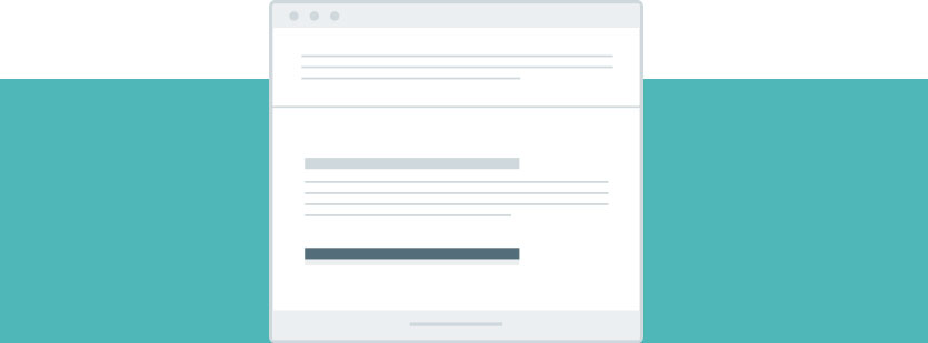
Pros: As the name implies, this content column is short and to the point. It tells you everything you need to know, and nothing more (it’s totally great for curiosity). It grabs the reader’s attention and gives a direct, singular CTA.
Cons: You can’t fit multiple messages into the single column. You can hit them fast and hard, but you’ll be forced to stay light on the details.
Best for gaining the attention of straight-shootin’ people that don’t have time to waste.
When we write emails, we take a lot of things into consideration. We put ourselves in the minds of our readers, and we try to understand what the schedule of these people looks like. Someone who gets many hundreds of emails every day probably isn’t going to have time to play email search games.
That’s where the short column comes in. It talks about a need the service fits, usually with a snappy subject line and even snappier content. We also consider geographical location when selecting emails – we’ve found that fast-paced New Yorkers are more receptive to the short column than maxed and relaxed Californians.
The Long Column
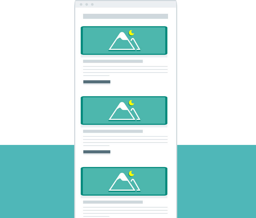
Pros: Long columns give you an open chance to focus your copywriting fire on one subject. It’s not about getting carried away with content, but it’s about giving a thorough and interesting hook into a subject.
Cons: The long column is the antithesis of the Z pattern. It’s usually adorned with visually appealing patterns and images, but the problem remains the same – it’s a relatively large amount of content in one funnel.
Best for targeting people that want more information on a subject, but don’t know where to go.
You can think of the long column as a “lite” version of the content you’re gonna get if you click on the CTA button. Compared to the short column, you get much richer content that primarily informs the client and helps them decide to pursue the CTA button.
In a way, it’s also catering to those that don’t have time to read through tedious emails. Long columns should lay out the core message of the subject, along with the supplementary materials, to give the reader a well-rounded picture of what they’re getting into. You’re telling the email recipient that you’ve got what they need, along with some reasons why they need it.
The Video Email

Pros: Keeps the copy and design to a minimum. Features video content front and center, giving the viewer a single target to focus on. There’s no chance of the viewer missing out on what you want them to see. It’s a binary system – either they click on it and watch, or they don’t.
Cons: Like I said, it’s a binary system. If the recipient of the video email isn’t going to watch the video immediately, they probably won’t watch it later. With videos, there’s no content-skimming from the surface. Video lengths shouldn’t exceed a certain lengths, but we’ll save that for another blog.
Best for leveraging C-level interest, namely CEOs.
To nobody’s surprise, C-level positions don’t have much time to waste. Even the most thoughtful copy that’s paired with the most revolutionary design can easily be deleted (or worse, ignored). Why, you ask? Because they receive a massive number of emails constantly, and they frankly can’t care about every one.
However, we’ve found the C-level Achilles heel. That’s right – videos. CEOs are more likely to watch a short video than than read through an email. Obviously, you’ll need to put together a compelling video to push your message… but then again, we’re pretty great at that too.
The Notification
Pros: Quickest email available. Provides an update in a few words, without unnecessary extras. TRIdigital’s notification email best practices always include an image of someone from the sending company, giving the email a personalized and more human touch.
Cons: Brevity isn’t always good – it can easily come off as unimportant. Though the announcement email may be important, it can quickly find itself in the email recycle bin.
Best for quick, personalized updates, such as thank-you emails following events.
Notification emails are light on copy and design, but both matter a great deal. We take great care to avoid them coming off as insignificant. And though they’re rather short and to the point, they convey a human element that makes a company stand out from its competitors.
The Subject Line-Up
Combining incredible email design with stellar content is an important key to success, but it still lacks a fundamental feature. What good is an email without a proper strategy behind it? It’s true that the email itself is selected, written, and designed to suit specialized needs.
It’s also true that it’s written to match the tone and message of the company, making each one of our emails one of a kind. Both of these things are part of a strategy to get people to open and actually click through the email.
In the end, that’s how we measure the effectiveness of our work. As a writer, I’m constantly thinking of catchy, informative, and clever subject lines that will get a recipient to open that email.
But how do you choose the best subject line? It’s hard to just assume that one is better than the other.
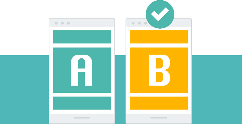
That’s why we always A/B test our emails. Most commonly, the writer (that’s me!) chooses two subject lines that they think will get killer open rates.
Right before we actually send out the email, we send two emails with the same content and different subject lines to a small sample group. Whichever wins will go on to the big leagues – the full mailing list.
We can also A/B test the email content itself. If we think there’s something worth testing, like different phrasing or alternate design, we’ll run two versions against each other (usually with the same subject line). From there, we check to see which click-through rate is higher. That indicates the content that was better received by recipients.
Even though Ricky and I are respective masters of our crafts, we still continue to study up-and-coming trends. We tweak our approaches to gain the best results with a combination of innovation and traditionalism.
That’s how everyone at TRIdigital operates, and that’s a large part of why we’re successful.
What I Learned
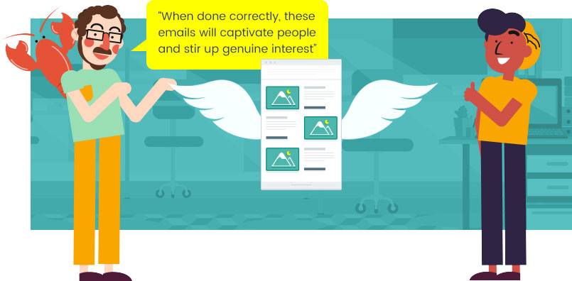
It turns out that good email design is much more than interesting images and snappy copy. It’s about how to effectively and strategically mesh those two together to complement each other for the overall message, all while retaining the individual personality and core values of our clients.
When done correctly, these emails will captivate people and stir up genuine interest around IT providers and their solutions.
It’s what we’ve done in the past, and it’s what we’re continuing to do. Of course, there’s always the occasional update here and there based on shifting marketing trends, but the core method remains ever-effective and useful.
If you want to find out more about how we can help you market your business effectively with some damn good emails, let us know. We’re more than happy to chat all about marketing with you, whenever you have some time.
And if you’re Red Lobster, you don’t need our help. You’re absolutely nailing it.